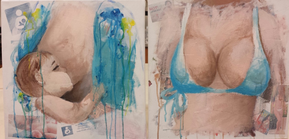
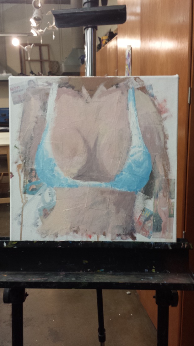
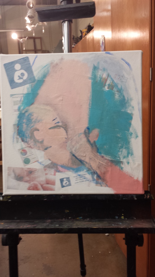
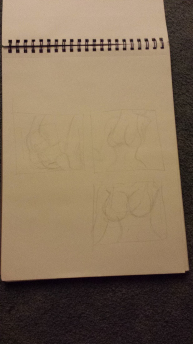
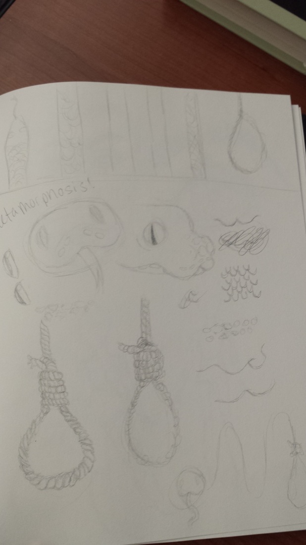
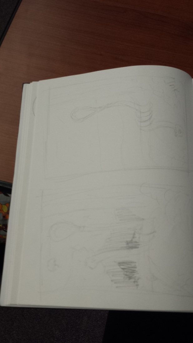
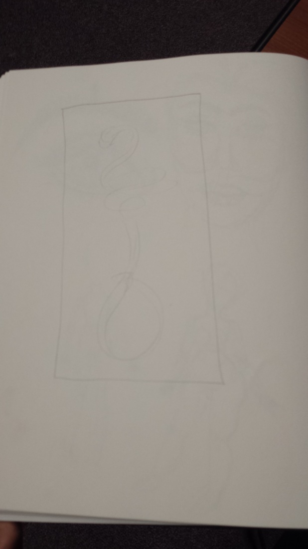
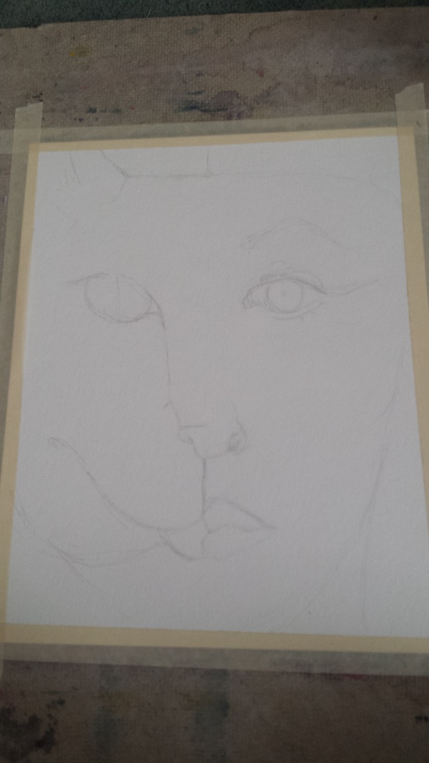
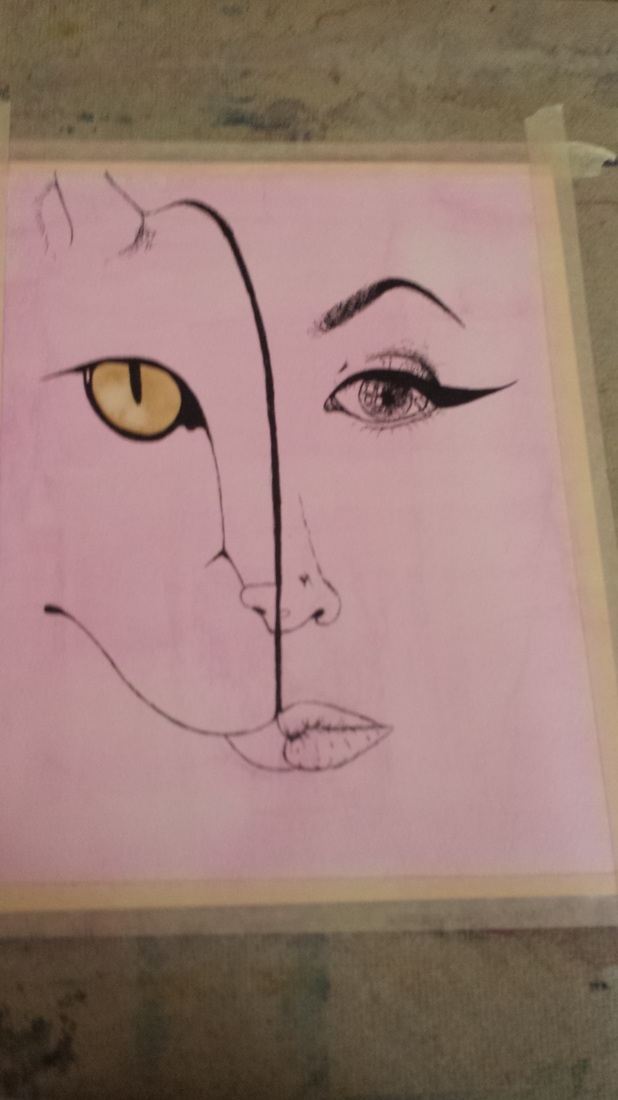
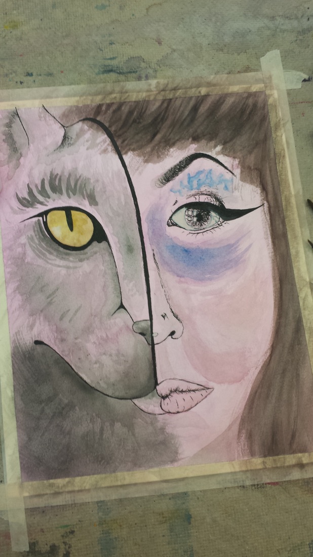
 For this project, I decided to collage pictures from magazine covers and statistics about breastfeeding on to separate canvases, gessoed over them, and painted with acrylics a mother breastfeeding and a close up of breasts in a bikini, forming a diptych. The point of this project was that I noticed people are perfectly fine with models in bikinis all over our media, but they're not okay with mothers using their breasts for their intended purpose - to feed their children. As a woman and equal rights advocate, I feel like this was a good focus for me and I'm glad I got to use the medium I did - acrylic. As I said previously, I've never used acrylic really. It turns out though, I really like it! The only painting I had done before was with watercolor, and I personally found acrylic to be much easier and forgiving, which I liked a lot. Overall this is one of my favorite artworks that I have produced because 1) I tried something brand new to me and 2) I actually used color! Progression Shots: 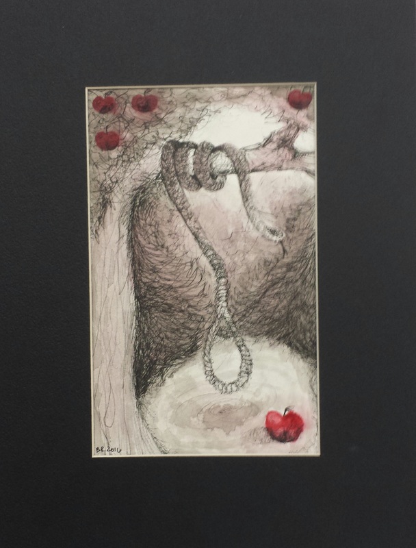 This work is very heavily focused on ink and line work. I later added in the red to make the apples stand out against the ink. The scene is probably best described as an "Adam and Eve" scenario, with the serpent and fruit and the noose representing, very harshly, a "bad choice" which would be in the bible story where Eve ate the fruit because the snake tricked her. I used counter change around the noose by making it really light and the bushes surrounding it very dark. The same can be said about the snake's head. I balanced the overall painting by adding the apples to the top after painting the apple in the bottom right. I added dimension by rounding the bushes and creating such a dark, deep shadow behind the tree. I think I could have done better on the apples. They're ugly and awkwardly placed, and I should have thought more before just plopping them on there. I like the finished work overall though, because I think my line work and mark making are my strong points in art. Progression Shots: 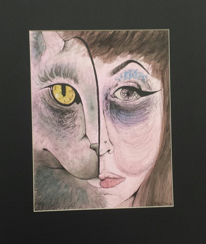 For this piece, I tried something sort of new to me. As of now, watercolor is something I have not worked too much with. On the other hand, I absolutely ADORE ink and line work. This piece combines something I'm beginning at and just getting the hang of with something I'm very familiar with and enjoy quite a lot. This is one of my first mixed media pieces, and certainly won't be my last, because of how well it turned out! I started with my sketch, then a pink wash and some yellow watercolor for the cat's eye. After that dried, I went in with pen and drew all the details in. I didn't plan on doing anything else with watercolor, however it turned out I kind of needed to or it would look unfinished. I was scared at first, but really glad I took the risk! I love how it turned out with my lines and markings on top of the colors. I think they compliment each other quite well. For my first time using this technique, I think it turned out very well and I'm quite proud of it. Progression Shots: |
AuthorProjects done in AP Studio Art at SASHS by me. ArchivesCategories |
 RSS Feed
